Overview
A real business, built from zero, designed at every layer
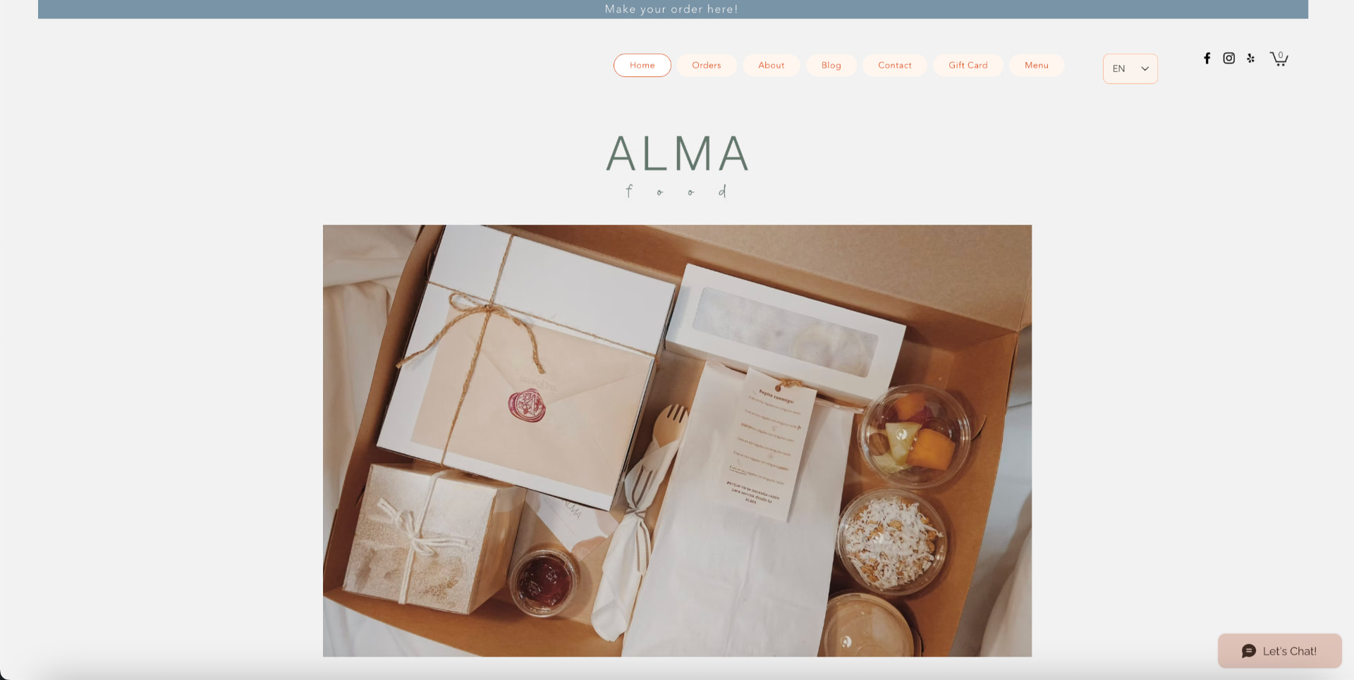
ALMA Food Box was a premium gourmet gifting brand celebrating Latino culture — delivering authentic, beautifully packaged Colombian-inspired food experiences to customers across the United States. Every box was made to order, designed to feel personal, seasonal, and emotionally resonant.
I co-founded ALMA and led it as sole designer across its full lifecycle — brand identity, packaging design, website, ordering experience, social media, photography direction, and seasonal marketing. Not a client. Not a contract. A business I built and ran.
Important context: ALMA was a mobile-responsive website — not an app. Every design decision was made for a browser-first experience that had to work beautifully on a phone.
The Problem
A gift market full of options that felt like nobody made them for you
The gift-giving market had a problem nobody was naming directly. Most established brands operated at national scale with impersonal, mass-produced offerings. You could order something, but it never felt like it was made for you. It felt like it was made for everyone — which is the same as being made for no one.
Edible gifts existed, but they leaned heavily into rustic, holiday-specific aesthetics that rarely achieved the kind of modern, elevated presentation that made someone feel genuinely cared for. And within the Latino community, the gap was even wider. There were no brands speaking their language — literally or culturally — in the premium gifting space.
Chicago had strong dessert options at every price point. Competing on desserts alone wasn't going to be enough. The real question was: what does a gift look like when it actually knows who it's for?
What does a gift look like when it actually knows who it's for?
Hypotheses & Approach
We didn't research our way in — we sold our way in
Most case studies start with a research plan. Ours started with selling.
Before designing a brand, a website, or a single visual asset, we spent five months selling homemade desserts through our personal social media profiles. No brand name. No strategy. Just product and people. We wanted to understand real purchase behavior before building anything permanent.
The desserts sold. But the market was crowded and the margins were tight. At some point I realized the desserts were just a vehicle — what people were really buying was the feeling of receiving something made specifically for them. The food was the medium. The emotion was the product.
That clarity became ALMA.
The Pivot
Desserts on personal profiles
Market too crowded, margins tight
Branded Colombian desserts
Cultural specificity resonated, scope felt limiting
A box of Colombian treats
The box format created value the items alone didn't
Full Colombian menu experience
The insight: it wasn't about the food. It was about the experience of receiving it.
Research & Exploration
52 participants, three years of seasonal feedback, and one Instagram account used as a live research tool
Phase 1 — Sell first, learn fast. Five months of unbranded selling through personal social media gave us something no survey could: real purchase behavior before any permanent decisions were made. We learned what people responded to, what they asked for, and what the market already had too much of.
Phase 2 — 52-participant structured research. Once the pivot direction was clear, I conducted research with 52 potential buyers covering: brand name preferences, color palette and visual identity direction, slogan options and tone, preferred gifting occasions, price sensitivity, and menu preferences. This research didn't just validate — it redirected. Participants consistently responded to the idea of a full Colombian food experience over desserts alone. They wanted something that felt like a whole occasion.
Chicago had no brand doing personalized gourmet food gifting. Not one. Our competitive landscape wasn't other food box companies — it was generic gift shops that felt nothing like us.
Phase 3 — Instagram as a live research channel. After launch, I built research into the product cycle. Every new seasonal menu was preceded by surveys distributed through social media and the website. Instagram became my fastest and most direct research tool — I used it actively to ask followers about new products, test product names, and gauge interest before committing to production.
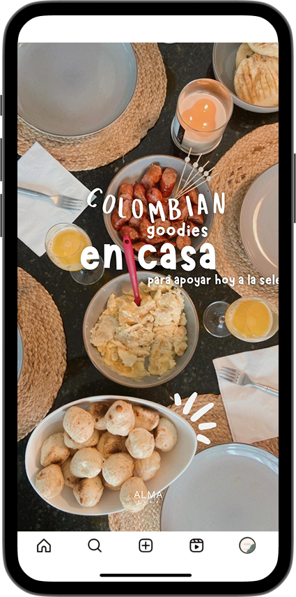
What performed best: behind-the-scenes content showing food preparation consistently outperformed product photography. That insight reinforced every brand decision about warmth, authenticity, and cultural storytelling. Latino customers noticed the bilingual website and mentioned it directly — it made them feel seen in a space that rarely acknowledged them.
Research-informed brand system
The 52-participant research informed every major visual decision. Participants consistently described the brand feeling they wanted as 'warm but sophisticated — like a gift from someone who really thought about it.' That became the design brief.
Color Palette
Typography
ALMA
food
Neue Montreal — uppercase, strength
Buffalo — lowercase, warmth
Photography Direction
— Light backgrounds, earthy tones, low saturation
— Behind-the-scenes content outperformed product shots
— Balanced compositions with breathing room between elements
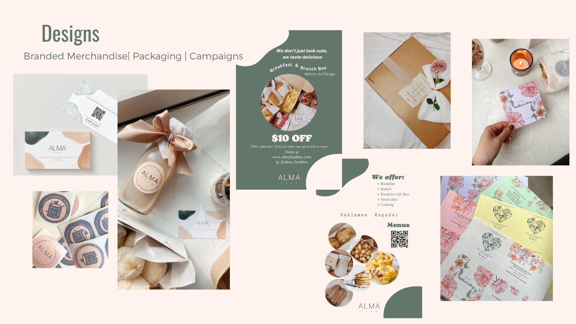
Brand Guidelines
Logo system · Color palette · Typography · Photography guidelines
Design Decisions
Five decisions that shaped the brand, the box, and the business
Every decision here had a business consequence. Not a UX consequence — a revenue consequence.
01
Restaurant menu format over product catalog
Two platform models were available. A product catalog was technically more 'correct' for a product business. But ALMA wasn't selling inventory. Boxes had too many variants to manage as SKUs, and we didn't want users to feel like they were shopping. We wanted them to feel like they were ordering something made for them. I chose the restaurant menu model. It matched the mental model of our users better, handled the made-to-order complexity more gracefully, and reinforced the brand positioning — you're not buying a box, you're placing an order for an experience.
What was traded away:
Stock tracking, inventory variants, and shipping management. Operationally more complex. The right call for the brand.
02
Bilingual by design — not as an afterthought
I built the site in both English and Spanish from launch — manually, page by page. It was time-intensive. But for a brand whose entire identity was cultural bridge-building, launching English-only would have been a contradiction. The Latino community was our first audience. They deserved to arrive and feel at home. Latino customers noticed and mentioned it directly — it made them feel seen in a space that rarely acknowledged them.
What was traded away:
Weeks of additional build time. Worth every hour.
03
The box as a designed UX touchpoint
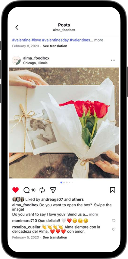
The physical packaging was treated with the same intentionality as any digital interface. Every item had a designated space. The order of discovery was sequenced deliberately — what you see first, what reveals itself as you unwrap. We calculated how long it should take a person to open the box, treating the unwrapping itself as part of the experience. When customers started describing the boxes as 'too pretty to open,' we knew the decision had paid off.
What was traded away:
Lower packaging costs. The margin hit was real. The 'too pretty to open' response was worth it — it became our primary word-of-mouth driver.
04
Pickup added post-launch from user feedback
The original plan included delivery only. Pickup was added after launch when customers directly requested it — they wanted the option to collect in person for speed and to avoid delivery fees on food orders. This wasn't in the original plan. It came from listening.
What was traded away:
Operational simplicity. Adding pickup created logistics complexity. The right call because our users said so.
05
Photography guidelines as brand infrastructure
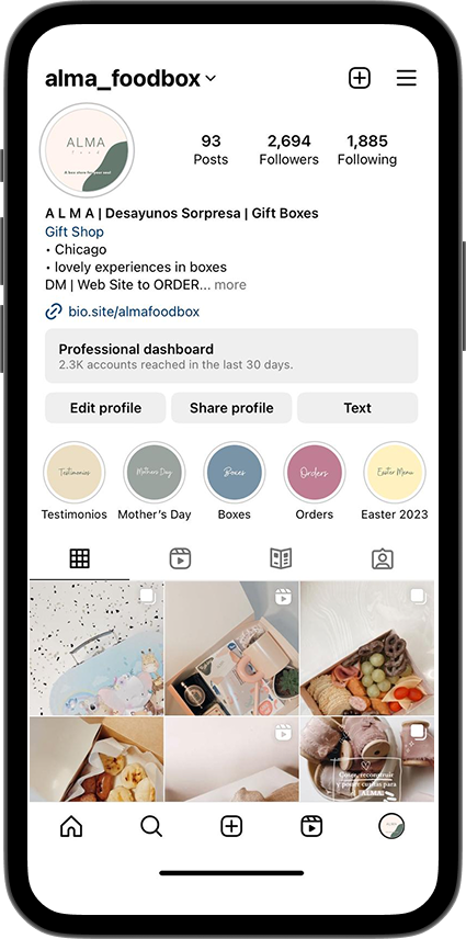
Early Instagram data showed that behind-the-scenes content outperformed product photography consistently. I documented this as a photography guideline for the entire team — light backgrounds, earthy tones, low saturation, with behind-the-scenes food preparation as a content priority. This wasn't aesthetic preference — it was data-backed direction.
What was traded away:
Nothing. This was a competitive advantage that cost only the discipline to follow the evidence.
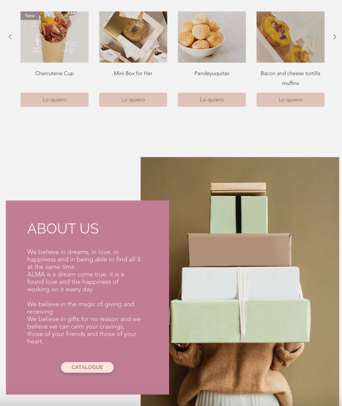
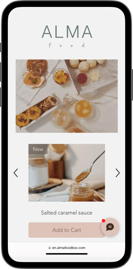
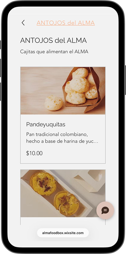
ALMA Food Box — desktop and mobile website design · almafoodbox.com
Where AI worked
Used for branded merchandise, campaign materials, seasonal flyers, and social media content — keeping the visual system consistent across every touchpoint without a design team.
Used for logo construction, brand guideline production, and photography direction assets — the foundation of ALMA's visual identity.
Instagram's native analytics became a research instrument — tracking which content formats performed, informing menu decisions, and validating product directions before committing to production.
The tools accelerated execution. The strategy was human.
Where I overruled it
— No tool could tell me that the restaurant menu format would feel more like ALMA than a product catalog — that was a brand judgment, not a technical one.
— Analytics showed behind-the-scenes content performed. Only human judgment decided that was a research signal worth building a guideline around.
— The unboxing sequence — what gets placed where, what you see first, how long it takes — no template or tool designed that. That was experience design made physical.
That part was mine.
Outcomes
What three years and 2,500 units proved
Three years. One co-founder team. Zero outside funding.
2,500+
Units sold
$65K
Annual revenue
3 years
In market
Valentine's Day & Mother's Day
Highest sales seasons — confirming the gifting positioning was correct
'Too pretty to open'
Most common customer reaction — confirming the packaging investment paid off