Overview
From invisible to discoverable — building a first digital presence from zero
Chicago Wheel Express had been a trusted B2B wheel repair operation for over a decade — solid reputation, strong operational infrastructure, loyal distributor relationships. But the business had hit a ceiling. Leadership saw an opportunity in the Chicagoland consumer market. The problem: there was no website, no consumer brand, and no understanding of what local buyers actually needed.
I was brought in as the company's first UX and digital lead. My role evolved quickly from "build a website" into something much broader: design the entire digital ecosystem from scratch, define how the brand would speak to consumers for the first time, and create the infrastructure that would turn an offline B2B operation into a B2C-ready business.
The UX and digital launch work was concentrated in 2021–2022, within a broader role that continued through 2024.
The core design challenge: how do you design a first-time digital experience for a customer segment the business has never spoken to — in a category where trust, locality, and credibility are everything?
Swipe to see the full map
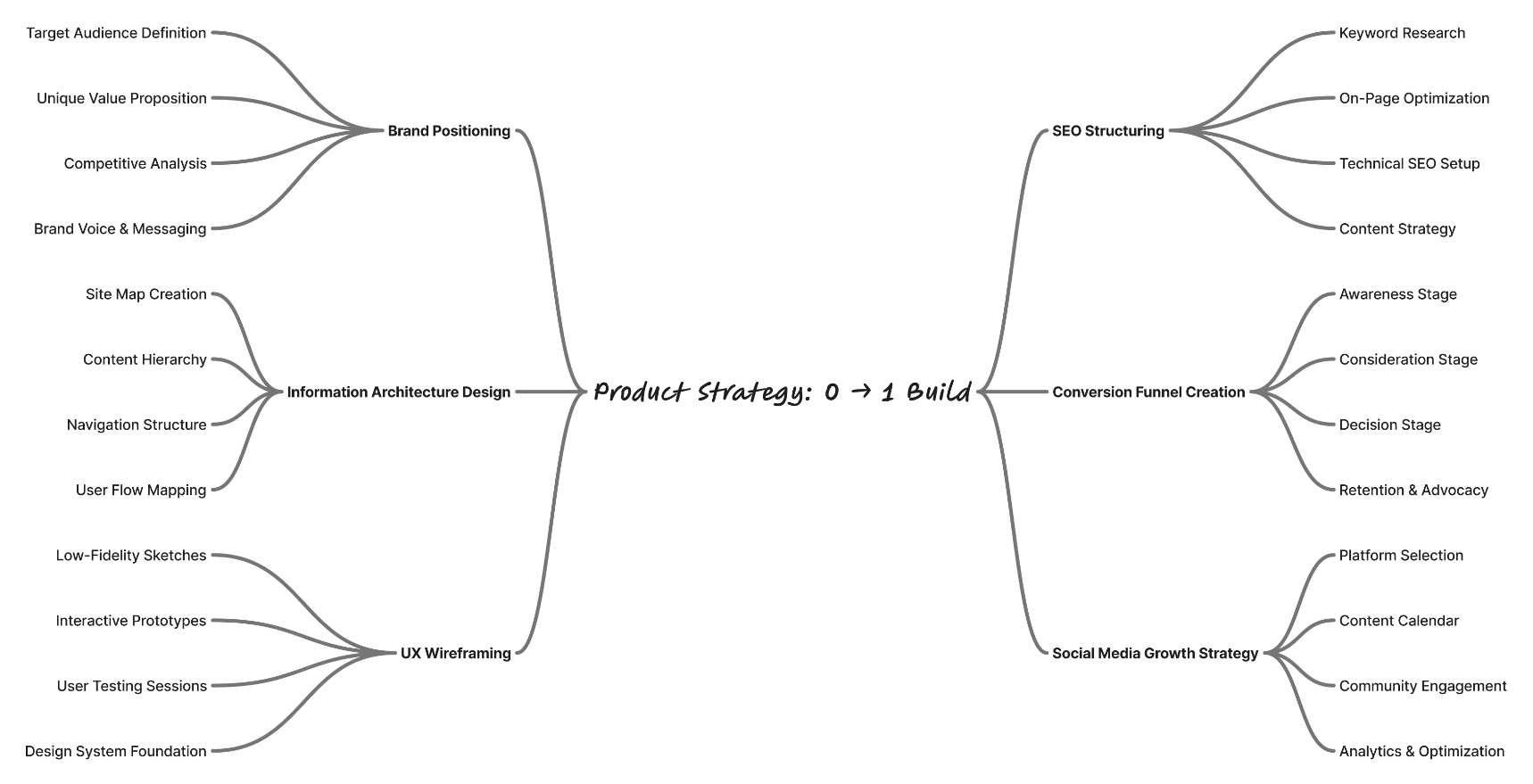
Product Strategy: 0 → 1 Build — brand positioning, information architecture, UX wireframing, SEO structuring, conversion funnel, social media growth
The Problem
The risk wasn't poor UX. The risk was invisibility.
A wheel repair shop with ten years of B2B relationships and zero consumer digital presence faces a specific kind of problem. It's not a UX problem. It's an existence problem.
The business had no online visibility, no consumer accessibility, no structured lead generation, and no brand positioning for B2C audiences. A first-time visitor searching "wheel repair Chicago" would find national chains, competitors with hundreds of Google reviews, and established local shops — and would have no reason to trust a business they'd never heard of with no digital footprint.
No website, no Google Business profile, no social infrastructure of any kind.
Everything had been built for distributor relationships, not individual buyers.
All business came through existing B2B channels. Zero consumer funnel.
The team knew their B2B customers deeply. Their B2C customers — not at all.
The risk wasn't poor UX. The risk was invisibility.
Hypotheses & Approach
No discovery phase, no usability budget — just close observation and honest stakeholder conversations
This was a live commercial engagement with real business constraints and a defined budget. There was no luxury of a formal discovery phase or structured usability testing at the start. What I had was close observation, honest stakeholder conversations, competitive awareness, and the discipline to let data settle disagreements rather than ego.
Mobile-first, always.
Early conversations with leadership made clear that target consumers were finding wheel services through local search on their phones — someone with a damaged wheel, or a driver researching options during a commute. Every design decision started with the mobile experience. Desktop was secondary. This meant ruthlessly prioritizing what appeared above the fold on a small screen, compressing the navigation, and making the primary CTA reachable with one thumb.
Trust before features.
Chicago Wheel Express had no online reviews, no established consumer reputation, and no digital presence. A first-time visitor had no reason to trust them. I prioritized trust signals above everything else: years in business, the B2B client roster as a credibility marker, real photography of the shop and the work, and a clear Chicago-local identity. The message underneath every design choice: we have been here for ten years, we know what we're doing, and we are part of your community.
A quote form would convert better than a phone number as primary CTA.
Leadership wanted the primary CTA to be a phone number — that's how B2B customers had always reached them. I believed a booking form would perform better with consumer audiences who prefer not to call for a first interaction with an unknown business. Rather than debating it, I proposed we test both and let the data decide.
Research & Exploration
Every available signal: competitor analysis, social listening, stakeholder interviews, and post-launch data
Without a formal research budget, I gathered insights through every available channel.
What leadership knew about their customers after ten years of B2B relationships. The richest source of domain knowledge available — and completely untapped from a design perspective.
Five local and national wheel services analyzed for information architecture, trust signal placement, and conversion friction. Key finding: most competitors buried their trust signals and made pricing nearly impossible to find — an opportunity to differentiate through clarity.
How Chicago consumers talked about wheel services online. What language they used, what they complained about, what questions they kept asking. This informed the content hierarchy and copy tone across the entire site.
Quote form submissions and direct calls revealed what customers needed that the site wasn't providing. The gallery emerged from this phase — not from the original design, but from listening after launch.
Crown Customs and Coatings
Strengths
- High reputation for powder coating and custom work (4.6 stars), full-service shop for premium cars.
- Slightly higher review volume and consistent praise for top-notch quality, pride in work, and premium automotive customization; strong in complex powder coating and full-shop vibe.
Weaknesses
- Located in Wheeling (farther from downtown), fewer extra services (tinting, detailing) than CWE.
- Fewer bundled extras (e.g., no strong mention of tinting/detailing); some warranty limitations noted in complaints.
Lee's Auto Clinic
Strengths
- Full-service shop (repairs + tires/brakes), good at powder coating and color changes
- Attracts one-stop clients; capable in curb rash fixes, bent/cracked repairs, and color changes/powder coating.
Weaknesses
- Less specialized in high-end/custom than CWE; more general focus.
- More generalist (less high-end specialization); may lack CWE's depth in luxury brand focus or fast standalone rim-only turnaround.
Chicago Wheel Service
Strengths
- High-volume 24/7 production for fast same-day minor repairs; full refinishing (including PVD chroming, two-tone machining); good for quick touch-ups and OE matching.
Weaknesses
- More tire/sales-oriented; CWE excels in premium customization.
- May feel more production-line than boutique.
Carrectly Auto Care
Strengths
- Multiple locations in Chicago, good cosmetic restoration.
- Very high ratings and massive review volume (far more than CWE); transparent upfront quotes, no upsells, strong warranties; excellent for luxury/EV vehicles (Tesla/Rivian) and overall vehicle value enhancement.
Weaknesses
- Broader service/auto care; less in-depth powder coating and custom work than CWE.
Symbolic Kustomz
Strengths
- Large inventory of custom rims, aggressive pricing, advanced repair (welding).
- Excellent pricing (competitive/honest), large inventory for custom wheels/tires/lift kits; strong in advanced repairs like welding; great for extreme custom builds.
Weaknesses
- More new sales than repair/refinish; CWE excels at preserving original parts.
- More sales-oriented (new wheels/tires) than pure repair/refinish; farther location reduces convenience for city-center customers; less emphasis on OEM-style preservation.
Click to enlarge
Competitive audit — Crown Customs, Lee's Auto Clinic, Chicago Wheel Service, Carrectly Auto Care, Symbolic Kustomz
Google Search
Home Page → Book Online
- Book Online
- Schedule service
- Booking form
- Follow-up call
Home Page → Services
- Home Page
- Services
- Make an appt
- Booking page
- Book now
- Schedule
- Booking form
- Follow-up call
Home Page → Make an appt
- Make an appt
- Booking page
- Book now
- Schedule
- Booking form
- Follow-up call
Home Page → Guarantee
- Home Page
- Guarantee
Click to enlarge
User flow — four paths from Google Search to booking confirmation
The CTA test
Phone number vs. quote form. We tested both. The data decided.
Rather than debating the phone number vs. quote form question, I designed both versions and proposed running them simultaneously. The form had a functional advantage I could argue for specifically: it allowed customers to upload photos of their wheels directly, giving the team the context they needed to provide an accurate quote before the first call. That removed friction on both sides — customers got a real number faster, the team spent less time on back-and-forth calls gathering basic information.
The result: form submissions outperformed the phone CTA in completed lead actions. Leadership aligned behind it — not because I convinced them, but because the data did. The phone number stayed visible on the page, but the form became the primary conversion path.
The bigger win wasn't the metric. It was establishing a shared language with stakeholders: design decisions at Chicago Wheel Express would be driven by evidence, not opinion.
Design Decisions
Five decisions — and the one that was settled by data, not opinion
Every decision here had a real business consequence. This wasn't a portfolio project — it was a live commercial engagement with a client who had been operating for ten years and had never had a consumer digital presence.
Home
Services
- Wheel Repair
- Powder Coating
- Custom Paint / Blackout
- Window Tinting
- Ceramic Coating
- Car Detailing
- Int/Ext Detailing
- Buffing & Waxing
Our Guarantee
- Limited Warranty
Contact Us
- Form
- Google Maps
- Call, text, e mail Info
Book Online
- Services
Social Media
- Tik Tok
Click to enlarge
Site architecture — 5 primary sections, 8 service sub-pages, all paths leading to a conversion action
01
Mobile-first information architecture
The sitemap was designed for a user searching on a phone, possibly mid-emergency. Five primary sections: Services, Our Guarantee, Contact Us, Book Online, Social Media. Every path led back to a conversion action within two taps. Desktop was designed second — not as an afterthought, but as an expansion of what mobile had already proven.
What was traded away:
Visual richness on desktop. The mobile-first constraint meant some desktop sections felt simpler than a desktop-first design would have produced. The right trade — the majority of consumers were on mobile.
02
Trust signals as homepage hierarchy
The homepage led with years in business, the B2B client roster, and real shop photography — not service listings, not pricing, not features. The logic: a consumer who doesn't trust you won't convert no matter how clear your services are. Trust had to come first.
What was traded away:
Immediate feature visibility. Some users had to scroll to find specific services. Testing showed they did — because the trust signals made them willing to.
03
Request a Quote instead of public pricing
Pricing was contested. Leadership was uncomfortable publishing prices publicly — wheel repair costs vary significantly by vehicle, damage type, and material. I understood the concern but also knew from competitor research that visitors who can't find pricing information often leave rather than call. We resolved it with a prominent Request a Quote flow — a simple form collecting vehicle type, service needed, and contact information — positioned as the primary CTA throughout the site.
What was traded away:
The transparency that public pricing provides. Some users will always prefer to see numbers immediately. The quote form was the right compromise given the operational reality.
04
Social proof through content, not a static gallery
After launch, customers were asking through the quote form and direct calls to see examples of the work before committing. Rather than building a static gallery page, I recognized that social media was already where the mobile-first audience spent their time. I led a content quality overhaul across Instagram, Facebook, and TikTok — improving photography standards, writing stronger captions, creating a consistent visual language. This served two purposes: visual proof for prospective customers, and a social media growth engine driving traffic back to the site.
What was traded away:
A controlled, curated on-site gallery. Social media content is messier and less controllable. The reach and trust signal it provided outweighed the control trade-off.
05
Bilingual website
Chicago's Latino community is a significant portion of the Chicagoland auto services market. I built the site in both English and Spanish — not as an afterthought but as a structural decision from the start. Two complete versions, consistent experience across both.
What was traded away:
Build time and ongoing maintenance overhead. Every content update required two versions. Worth it — it opened the site to a customer segment competitors weren't speaking to.
Swipe to see all six screens
Click to enlarge
Before and after wireframes — Home Page, Services Page, Book Online Page — mobile-first redesign
Swipe to see all six layouts
Click to enlarge
Before and after wireframes — desktop website layouts for Home Page, Services Page and Book Online Page
Where AI worked
Used for analytics tracking, conversion data collection, and A/B test result analysis — the data that settled the CTA debate and informed every post-launch iteration.
Used for brand identity assets, photography direction, and social media content production — building the visual system that made the shop's work credible online for the first time.
Platform analytics across Instagram, Facebook, and TikTok tracked which content formats drove the most site referrals — turning social media into a research instrument, not just a publishing channel.
The tools gave me data. The judgment was mine.
Where I overruled it
— No tool could tell me that a consumer finding a wheel shop mid-emergency on their phone needed trust signals before they needed service listings.
— Analytics showed form submissions outperformed calls. Only human judgment decided that meant the form should become the primary CTA — not just a supporting one.
— The gallery insight didn't come from data. It came from reading between the lines of what customers asked for in quote form submissions and direct calls.
That part was mine.
Outcomes
70% traffic growth. 35% revenue increase. The first consumer-driven growth in ten years.
Within the first year of launching the consumer digital experience:
70%
Website traffic growth — first measurable consumer digital audience, built from zero
35%
Revenue increase — first consumer-driven growth in ten years of operation
Phone → Form
Primary CTA shift — from phone-only first contact to structured digital funnel with form-based lead capture
2x
Purpose served by social content — visual proof for customers and traffic driver back to the site
For context: the average website traffic growth for a small business investing in digital for the first time is typically 20–40% in the first year. 70% — starting from no website at all — is well above that benchmark. And 35% revenue growth from a 10-year-old brick-and-mortar B2B business that had never had a consumer channel is the number that connects design work directly to business impact.
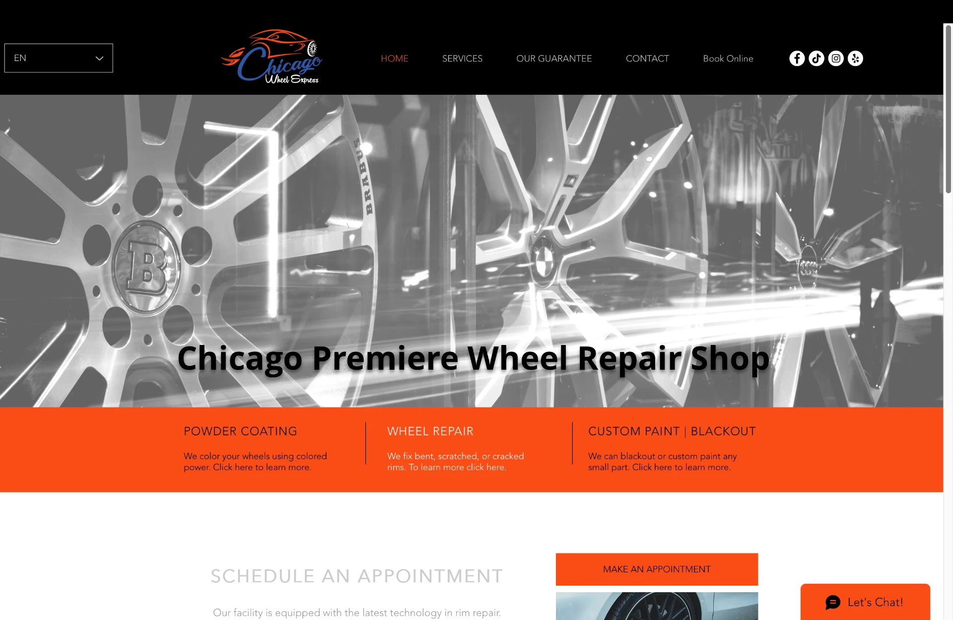
Chicago Wheel Express — live website, still active at chicagowheelexpress.com
What this project reinforced
Replace opinion with evidence wherever possible.
The tension with leadership over the CTA was one of the most valuable experiences of the project. Proposing to test both approaches instead of arguing for my preference turned a potential conflict into a shared decision.
Listen harder to post-launch signals.
The gallery wasn't on my radar at the start. Users put it there. The best design decisions in this project weren't the ones I made at the beginning — they were the ones I made in response to what I learned along the way.
The right solution isn't always a new page.
Sometimes it's meeting users where they already are. The social media content strategy solved the gallery problem better than a gallery would have.
Real-world UX work rarely looks like a textbook process. What matters is close observation, honest stakeholder conversations, and the discipline to let data settle disagreements rather than ego.