A four-week design challenge that became a complete product
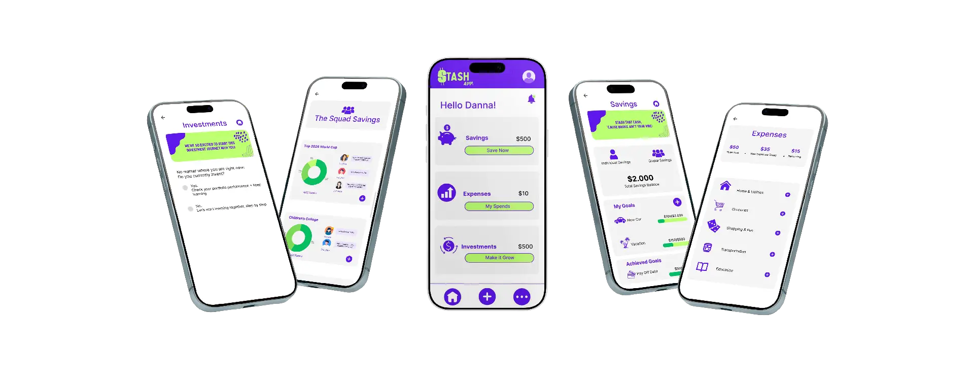
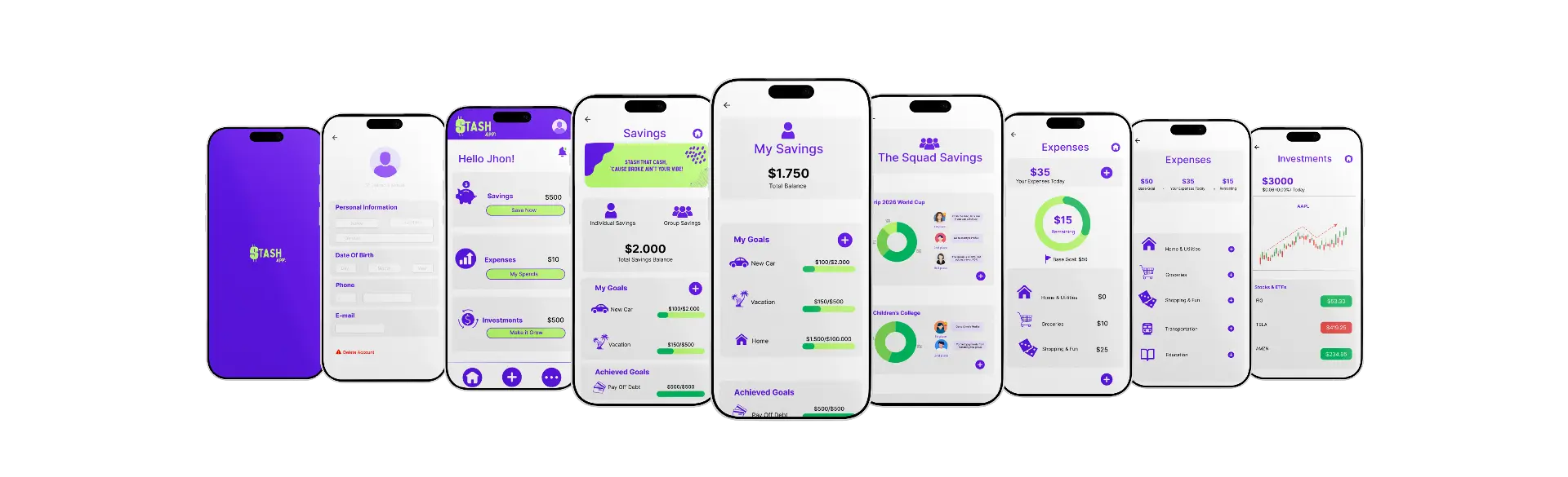
Stash is a mobile savings app for individuals, families, and friend groups — designed to make saving social, transparent, and genuinely motivating. It combines personal goal tracking, shared group pots with accountability features, expense management, and a beginner-friendly investment module.
This was a self-initiated design challenge. No client, no brief, no deadline except the ones I set myself. The goal was to design a complete product — research through high-fidelity prototype — and document every decision along the way.
The constraint that shaped everything: money is emotional. Every design decision had to balance the excitement of a game with the seriousness that financial tools deserve.
Timeline
Jun – Aug 2025
Role
End-to-end Product Design
Status
High-fidelity prototype · Usability tested
The Problem
Why do people who want to save still fail to save?
Most people don't fail to save because they lack discipline. They fail because saving feels lonely, invisible, and disconnected from the rest of their financial life.
They set a goal and forget it. They track expenses for a week and stop. They try to save with a partner or family and the process becomes chaotic — no one knows who contributed what, commitments dissolve quietly, and the group pot disappears into confusion.
The existing apps didn't solve this. Budget trackers were clinical and joyless. Group savings tools were opaque. Investment apps assumed prior knowledge that most users didn't have and weren't given.
The design question wasn't "how do I build a savings app?" It was: how do you make saving feel less like a sacrifice and more like a game worth playing?
How do you make saving feel less like a sacrifice and more like a game worth playing?
Group transparency
Participants drop out, contributions go untracked, and there's no visibility into what others are actually doing.
Manual tracking
Monitoring spending and saving progress feels exhausting. For the habit to be sustainable, it needs to feel automatic.
Financial chaos
Users struggle to see the relationship between their spending, their goals, and their progress.
Income growth
Not a second job, not risky investments — users want small, manageable actions that compound over time.
Hypotheses & Approach
The bets I made before I talked to anyone
Three bets made before research began. All three held — but one needed to be rebuilt after testing.
✓ Held
Group savings needs accountability, not just visibility.
Transparency alone isn't enough. People need a savings history per contributor, commitment tracking, and a gentle social layer — leaderboards, badges, a chat feature — so accountability feels motivating rather than punitive. This was the core of Stash's social design from day one.
✓ Held — with nuance
Gamification makes financial consistency sustainable.
The hypothesis held, but execution needed calibration. The line between 'this feels fun' and 'this feels childish with my actual money' is narrower than I expected. Every game mechanic had to earn its place by making the financial behavior it supported more likely to happen.
↻ Rebuilt after testing
A single investment experience works for all users.
This was the bet that broke. I assumed users could navigate investments with good visual design and clear labeling. Testing proved otherwise — most participants felt excluded from the investment section entirely, not because of bad UX, but because the feature assumed financial literacy they didn't have. The solution came from users, not from me.
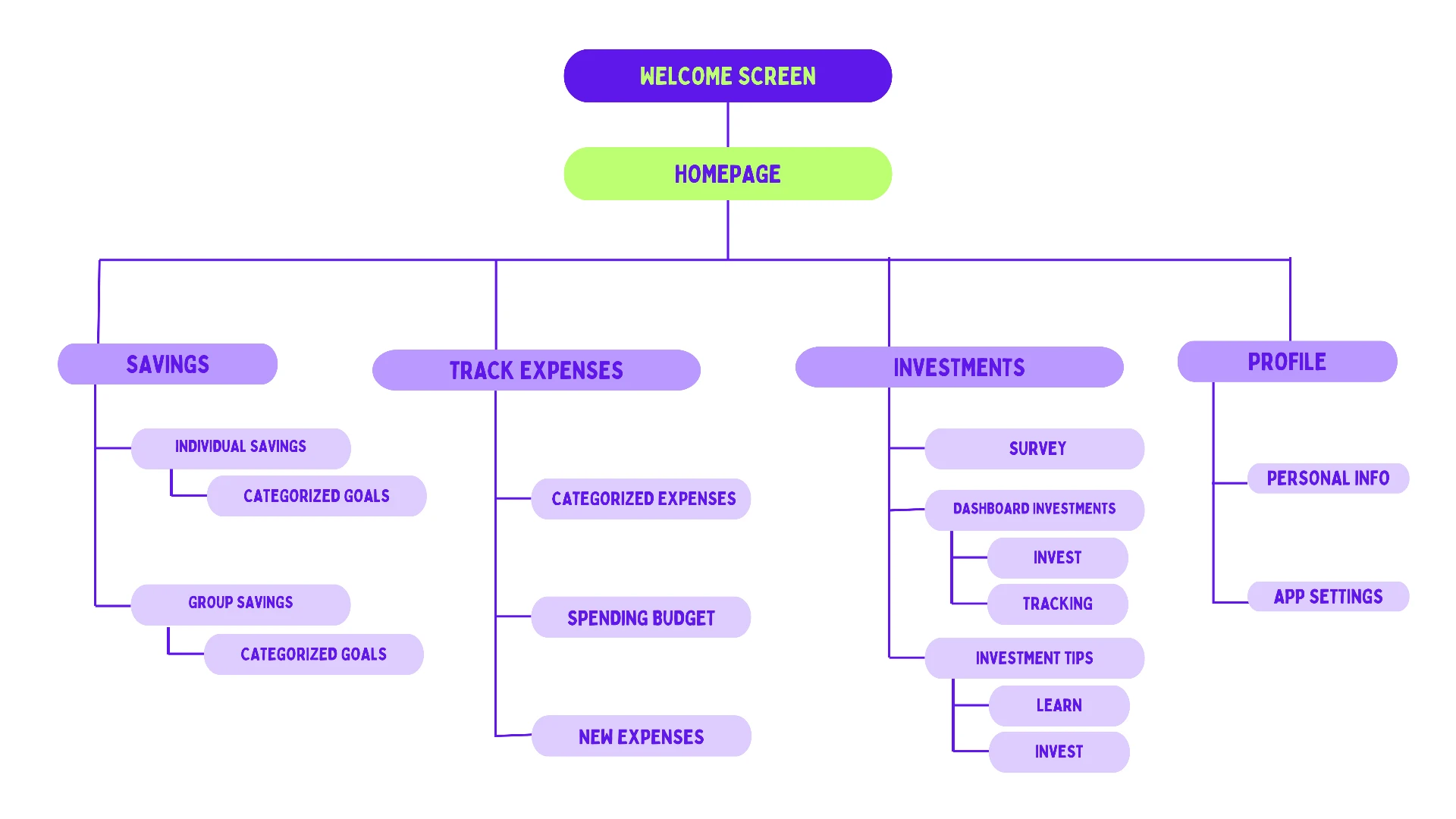
Information architecture — the shape of the app before any screen was designed
Research & Exploration
What users confirmed, what they changed, and what surprised me
Research began with surveys and interviews across the target demographic — people aged 30–65 interested in savings and investment tools, including people with no prior experience in either. The goal was to understand not just what people wanted from a savings app, but what made every previous attempt fail.
Key finding before any wireframe was drawn: the emotional experience of money was being completely ignored by existing tools. Users didn't just need features — they needed to feel competent, not judged, and in control.
Competitive Audit
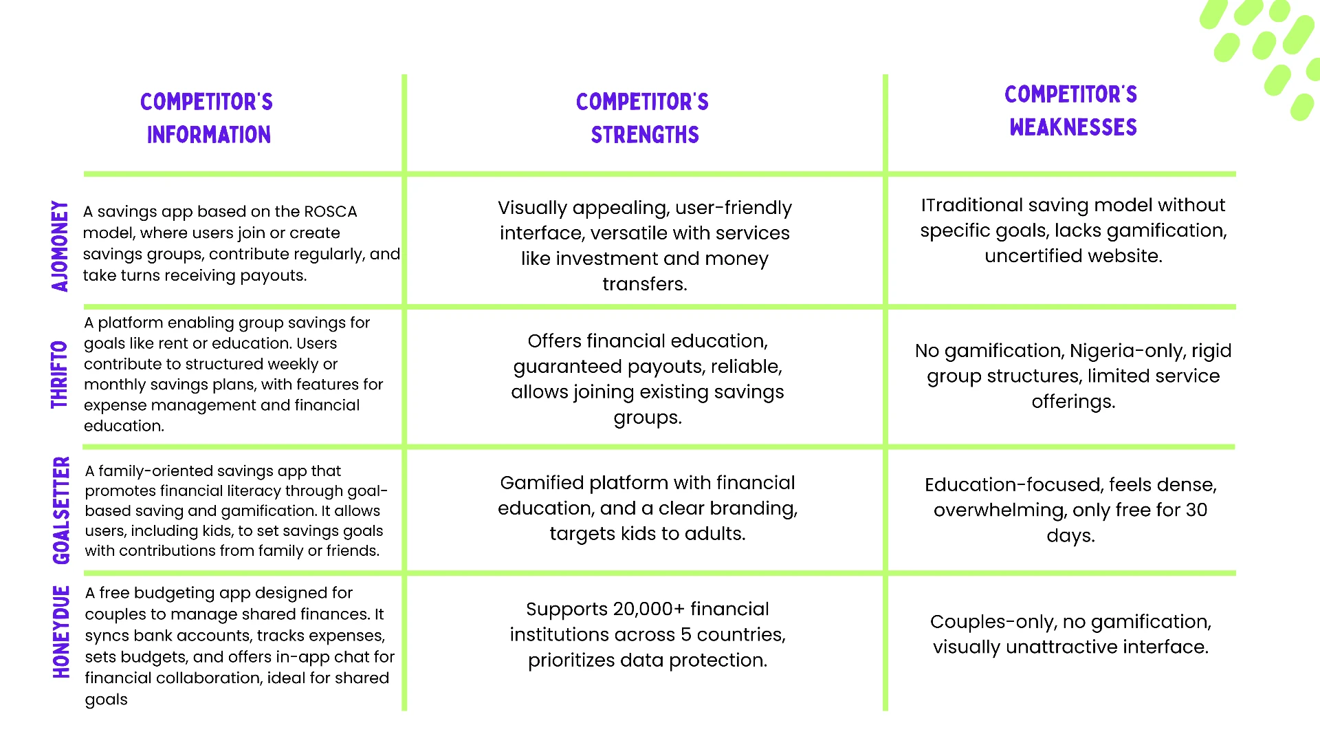
Four competitors audited — AjoMoney, Thrifto, GoalSetter, and HoneyDue. Finding: none of them combined gamified group savings with individual goal tracking and investment access in one product. The gap Stash was designed to fill was real and unoccupied.
Two users. Two very different relationships with money.
Both arrived at the same conclusion from different directions: saving alone, without structure and without accountability, doesn't work.
Benjamin, 21
Systems engineering student in Portland. Scholarship covers 60% of tuition. Works part-time as a computer repair technician. Saving goal: a professional mountain bike to compete in races.
“I believe we can be successful in as many areas of life as we want — we should be focused as at cycling and organized as at engineering.”
Click to enlargeTap to enlarge
Anna, 35
Artist at a Chicago museum. Married to Paul, a freelance opera singer with inconsistent income. Paying off student loans and credit card debt. Saving goal: a house and financial stability before starting a family.
“I feel like every day counts, but I also want to offer the best to my children — that's why I would love to make a financial plan.”
Click to enlargeTap to enlarge
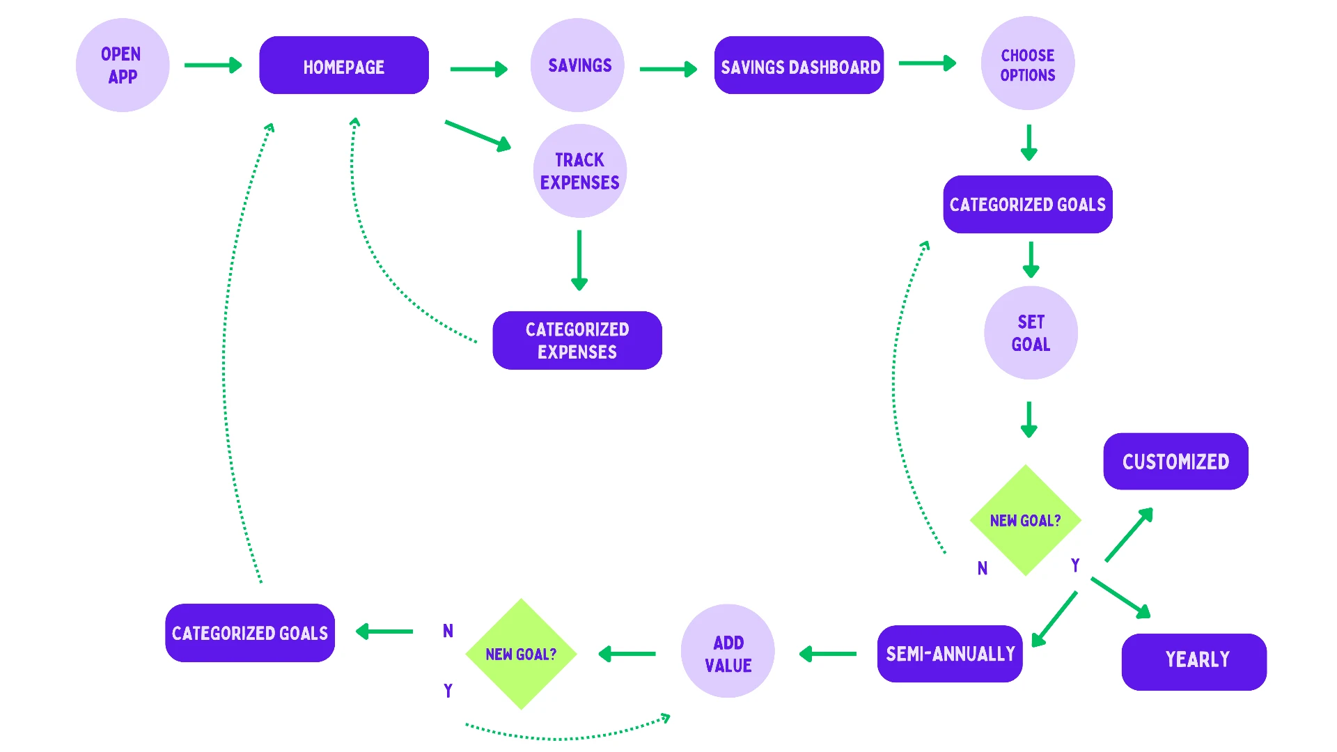
User flow — setting a savings goal, and the decision points that branch the path
Usability Testing
One round. Moderated. In person. Five participants.
Over two days in November, I invited five participants to my office in Chicago for moderated sessions — 30 minutes each, think-aloud protocol, six task prompts. Participants ranged from ages 30 to 65, two men and three women, a mix of savings experience levels, including one user of assistive technology.
I watched them complete tasks in Stash — starting a group savings challenge, reviewing goals and expenses, exploring investment basics — while asking them directly: Is this intuitive? Does it feel like a game? Does it motivate friendly competition? What helps you save the most?
One user hesitated during onboarding and said: 'I love the idea of improving my income, but I have no idea about investing and I got confused about where my money actually goes.' That honest moment highlighted mistakes I had made in labeling and flow.
Usability Study Plan
Moderated study · Chicago · 5 participants · 6 task prompts
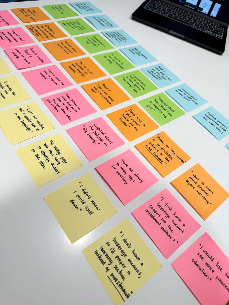
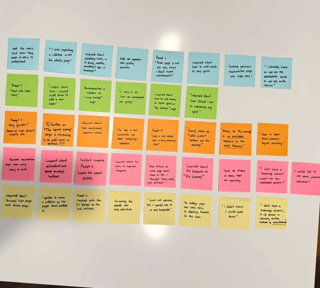
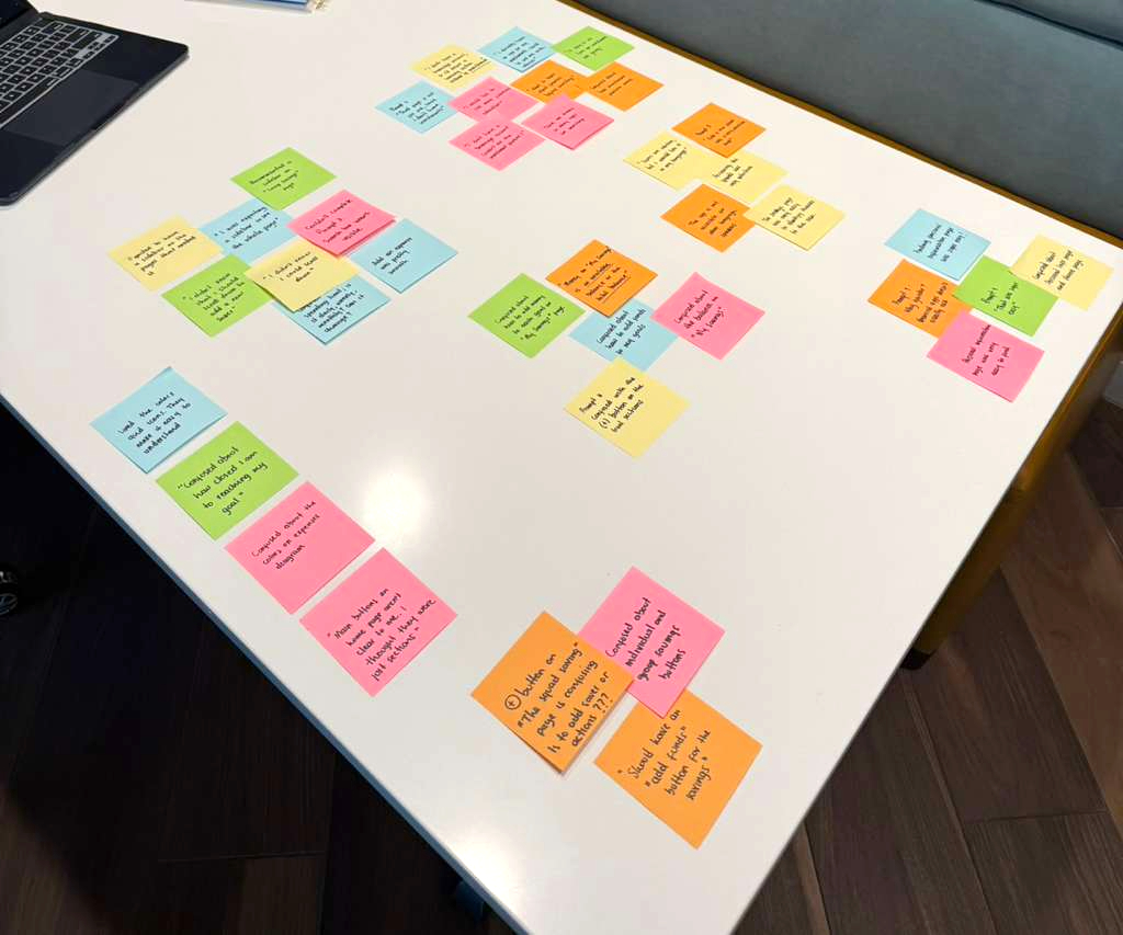
Five participants. Two days. One table covered in sticky notes. This is where the findings came from.
Affinity mapping after moderated usability sessions — Chicago, November 2025
What Testing Revealed
Excluded
Most participants felt shut out by the investments section — not because of bad design, but because the feature assumed knowledge they didn't have.
Confused
Every single participant got confused by the '+' button — they couldn't tell if it added money or created a new goal.
Missing content
4 out of 5 participants completely missed content below the fold — they simply didn't scroll.
Design Decisions
What the screens looked like before — and what testing made me fix
Five decisions. Each one came from something a real user did or said during testing.
FROM SKETCH TO SCREEN
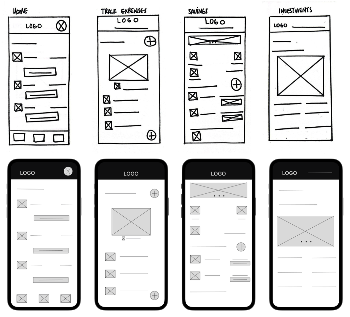
Every screen started on paper. The digital wireframes came second. High-fidelity came last — after the thinking was done.
Paper sketches to digital wireframes — Home, Track Expenses, Savings, Investments
01
Investment onboarding segmentation
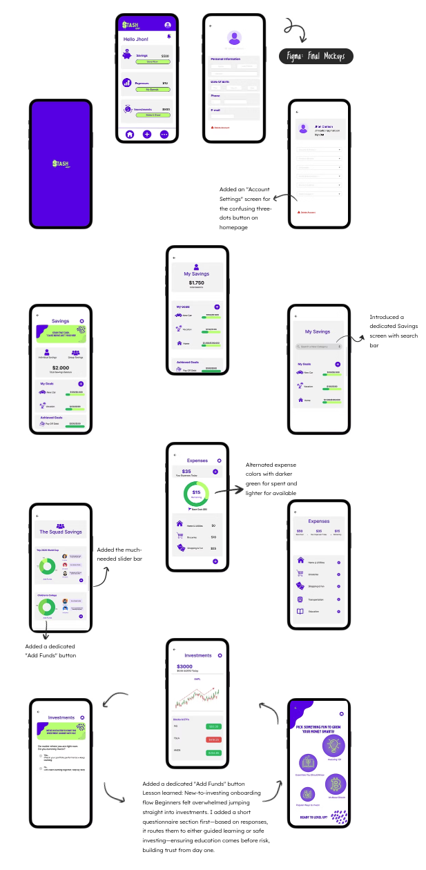
Most participants felt intimidated by investments — not because the design was unclear, but because the content assumed financial literacy they didn't have. It made the app feel like it wasn't built for them. The solution came directly from users: a short onboarding survey that routes people into two experiences. Experienced investors go straight to their performance dashboard. Beginners enter a friendly educational hub — short lessons, tutorials, guided steps — where education comes before risk.
What was traded away:
A single unified investment experience. The split adds complexity to the information architecture. That's the right trade — a feature that works for 20% of users is not a feature.
02
The '+' button redesign
Every single participant got confused. The problem was ambiguity — did it add money to an existing goal or create a new one? In both individual and group savings areas the confusion was identical. The solution: a dedicated 'Add Funds' label on the primary action, plus a modal with a searchable goal selector and category suggestions. Adding money and creating goals became two completely separate, unambiguous actions.
What was traded away:
Visual simplicity. The original '+' was clean. The modal adds a step. In a financial app, one wrong tap can feel serious — the extra step is worth it.
03
Persistent sidebars for navigation
Four out of five participants completely missed content below the fold — they didn't scroll naturally. The fix was persistent sidebars on the pages that needed them, making navigation visible and key sections impossible to miss.
What was traded away:
Screen real estate. Sidebars take space. The alternative — users missing critical financial information — was worse.
04
Multilingual support
Users who didn't speak English found the interface hard to approach despite intuitive icons. A clear language selection in settings removed a barrier that shouldn't have existed in the first place.
What was traded away:
Nothing meaningful. This was a missing feature, not a trade-off. Inclusion is not optional.
05
Account Settings screen
The three-dots button on the homepage confused users — they didn't know what it contained or what it controlled. Adding a dedicated Account Settings screen with clear labeling eliminated the confusion entirely.
What was traded away:
One extra tap. The reduction in confusion was disproportionately larger than the cost of the additional screen.
Annotated mockup iterations — screens before and after usability testing, with marked changes
Where AI Worked
ChatGPT
Used for research synthesis and competitive analysis — processing survey responses and surfacing patterns across user interviews faster than manual review.
Figma Make
Generated layout variations and component explorations in minutes. Used to pressure-test visual directions before committing to high-fidelity screens.
Canva
Used for presentation and documentation assets — persona cards, journey map layouts, and case study slide formatting.
AI gave me speed. None of it gave me judgment.
Where I Overruled It
—AI couldn't tell me that the investment section wasn't just unclear — it was making users feel like the app wasn't built for them.
—It couldn't decide that a modal was worth the extra tap when money is involved and confusion costs trust.
—It couldn't sit in a room with five real people and watch where their eyes went, where their hands hesitated, and what they said when they thought they were wrong.
That part was mine.
Outcomes
What this project proved — and what comes next
Stash is a research-tested high-fidelity prototype. These are design outcomes — what testing proved worked, what changed, and what a second round would measure.
5/5
Participants confused by the '+' button — resolved through modal redesign and dedicated 'Add Funds' label
4/5
Participants missing content below the fold — resolved through persistent sidebar navigation
100%
Of intimidated investment users now have a designed path in — through onboarding segmentation
01
Feature rebuilt entirely from user feedback — investment onboarding survey, not from the original design brief
What I'd Measure in Round 2
01
Investment onboarding completion rate
Do beginners complete the survey and enter the educational hub without dropping off?
02
Goal creation completion rate
Does the new modal reduce abandonment compared to the original '+' button?
03
Group savings engagement over time
Do users return to contribute after the first session?
04
Language setting adoption
What percentage of users change from English, and does retention differ by language?
Small changes have disproportionate impact in financial products. A confusing label, a missing cue, an assumed level of knowledge — any one of these can make a user feel the product isn't for them.